
First-time readers, the dialogue in this blog is set in the future (sometime after the year 2020). Each entry assumes there has been a 5th revolution in the US — the Revenge Revolution. More about Revenge Revolution and author, Entry #1. List and general description of entries to date. Annual assessment if Revolution plausible.
Note: most characters appear in a number of entries, with many entries building on previous conversations. Profile of characters. You’ll catch on quickly. Thanks for your time and interest…and comments.
Scene: Gelly, Jordan’s assistant, has been editing and updating a primer Jordan wrote about 2011. Section starts Entry #235. (Primer will be available as PDF in more traditional format after Chapter 5 or 6. Then the primer download will be updated regularly.)
Gelly: “Jordan, my apologies. I’ve fallen behind on editing the primer. I’m working on catching up but it might be another week or so .”
 Jordan: “No apologies necessary. We both took a week off from the business. And, yes, I’m behind on some of my work as well. What’s the topic of the next chapter?”
Gelly: “Seasonally adjusted annual rates and trends. I confess, it was not a topic that gave me goosebumps. However… ”
Jordan: “I take the ‘however’ to mean it wasn’t so boring.”
 Gelly: “Actually, it was interesting. Now, I think I understand what it’s all about.”
Jordan: “Good, let’s see what you think we should publish.”
———— CHAPTER 5 ————-
If you thought Chapter 4, the write-up on unemployment was confusing, go grab a coffee. The concept of seasonal adjustments is widely used…and also widely misunderstood.
 Economic data are frequently reported as being “seasonally adjusted” and equal to an “annual rate.” Just what does that mean? A “seasonally adjusted annual rate” (aka, SAAR) is an attempt to predict what sales would be for an entire year, recognizing that sales for many products vary month to month and are not simply 1/12 of the total for the year.
Two examples:
- Sales of gift items are higher at certain times of the year – Valentine’s Day, Mother’s Day and especially leading up to Christmas. Sales of these-type items might be very strong one month and fall-off sharply the next month, or months because of the “pull-ahead” effect. The term “Black Friday” originated in the retail business because the Friday after Thanksgiving is when retailers usually began making money for the entire year, or as accounts say “going in the black.” These monthly swings in sales make it very hard to gauge whether sales are headed up or down. Without some sort of “seasonal adjustment,” a manufacturer or retailer might view lower sales in January vs. December as negative when in fact the sales pattern might be improving. The seasonal adjustment attempts to “normalize” sales for the month.
- Sales of cars and trucks in the US are lower in the winter months as people spend money on Christmas gifts and delay buying new cars/trucks during inclement weather. Thus, sales of cars and trucks in the winter – and then the spring – need to be “seasonally adjusted” to help gauge whether sales are trending up, down or staying about the same.
Seasonal adjustments are often based on averages of actual data over a given period – say 5-10 years. Because of changing economic conditions, sales activity in any given year probably will be somewhat different from the “average” sales pattern. Adjusting the data for individual months or quarters can help determine sales trends.
Calculating Seasonal Adjustments. While there are some sophisticated techniques to calculating how each month should be adjusted, the reality is for many users there are no  published seasonal adjustments. To create your own seasonal adjustment, start by making a table with at least five (5) years of sales data by month. If you have 10 years, great. More than 10 years, stick with 10 years for now.
Begin by adding up sales for all the January’s, then the February’s and each month of the year. After you have totaled 5 (or 10) years of sales, then divide total January sales by total sales for all five years. If you’re in the lawn chair business, the “seasonal adjustment” percentage for sales of chairs in January should be less than 8.33% (1÷12). Sales of lawn chairs in June should be well above 8.33%.
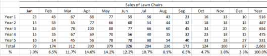
To calculate the “seasonally adjusted annual rate for this year’s sales in January, simply divide sales by the January percentage (%). If January sales in Year 6 were 50 lawn chairs and the “seasonal adjustment” percent was 3.0% (well below average), the seasonally adjusted annual rate of sales would be 1,667 lawn chairs. If sales of lawn chairs in June were 125 (75 units higher than January) and the June adjustment percent was 12.2% (above average), the annual rate would be 1,000 units – a significant decline from the seasonally adjusted annual rate in January and an indicator that sales might be trending downward.
What Are Trends? Would you believe someone who claimed the weather last June 12 was an indicator of what the weather would likely be for the next 12 months? In fact, most people would laugh at such an assertion. Yet, many of the same people believe a politician or talking head when single economic data-point is used to justify a claim that a particular program is working or not working.
The period for determining trends can vary. Depending on the subject matter, reports of activity are issued weekly, monthly, quarterly and some annually. When viewing data, it is important to consider the type of data and how frequently a change becomes meaningful.
 Data for weather may be the most extreme example. Weather conditions and temperatures change daily, even hourly. However, what constitutes a change in weather “trend”? An early frost or a late snowfall might simply be an aberration. But a pattern of increasing temperatures year after year after year indicates a change in the trend.
But what about trends in economic data or a company’s sales data? How does one calculate a trend? Are sales of lawn chairs headed up or down…or staying about the same?
Calculating a trend line can be as simple as plotting data on a chart and then taking a ruler and adjusting it so ½ the data points are above the ruler and ½ are below the ruler. This “eyeball” method is not a bad place to start.

In this chart of lawn chair sales, the “linear” trend line — i.e., ½ the data points are above the trend line and ½ below the trend line — suggests that:
- Monthly sales bounce around…a lot
- Overall, sales are improving…maybe
- Using data for any single month is not an accurate predictor of other months
 A more sophisticated method to fit the data is called “exponential fitting” (think of compound interest rates on your savings). For many sets of data, using an “exponential” trend line provides a more accurate picture of the results. Using an exponential fit, the trend line indicates sales of lawn chairs are flat to falling compared to rising sales using a simpler liner trend line.
While the differences between the linear and exponential lines may not seem significant, if you were in charge of manufacturing for the lawn-chair company, the difference could change your decision. If you looked only at the data using a linear trend, you might add to the production schedule, assuming that sales were likely to increase. However, if you looked the data fitted exponentially, you would not add to the production schedule and might even consider reducing the schedule.
There are several credible methods to calculate trend lines. If you use Excel or a similar program, most have formulae built into the program. Sometime you will also hear these methods referred to as “regressions.” If you decide to use more sophisticated regression techniques to calculate trend lines or “fit the data,” and have not completed college-level statistics – or do not remember – I suggest you read at least two articles on the plusses and minuses of the best approach for a particular task.
![]() Trend lines, aka regressions, can be extremely useful when looking for patterns. When I was a grad student at MIT, there was an oft repeated saying among the professors, “When in doubt run a regression.”
Trend lines, aka regressions, can be extremely useful when looking for patterns. When I was a grad student at MIT, there was an oft repeated saying among the professors, “When in doubt run a regression.”
The “when-in-doubt” advice was sound and has served me well over many years in many different jobs and in addressing many different problems. Regressions and trend lines help you create some order out of chaos.
The seasonally adjusted annual rates and the trend lines described in this section can help reduce the risk of making a terribly wrong decision. Try both approaches individually, and then in combination. I think you will find the approaches very useful. Just do not make the analysis too complicated.
